MBN
I joined the MBN team in early 2018 as a Product Designer when they were looking for someone who could help blueprint a complete refactoring of their existing tools.
The idea behind MBN is to create a safe space for deals between traders and investors and allow them to specify certain conditions that must be met, otherwise the contract will be immediately terminated.
And although this can sound quite straightforward, one of the main problems I saw has been how much the project is unclear to many who are not already familiar with the cryptocurrency or other exchange platforms.
I adore a quote that Brian Armstrong once said:
Thus, my main focus was to make the interaction and purpose of the platform as simple as possible. So I started with collecting feedback...
Since I was absent from the very beginning and I joined it when it already had some customers and community around, the first thing I decided was to collect feedback from all those who would be upset they would never be able to use the platform again.
And I'm not going to lie, the process of collecting feedback is my favorite step in the roadmap for creating any product. It's amusing, it feels great, and it's helpful as hell. Through 20-min or even text interviews with people who are really interested in improvements, I was able to learn a lot about the industry, product, and unsolved problems in just a few days.
And more importantly, each of the clients with whom I've had conversations — felt an incredible joy to share feedback with someone from the project team they love and just be genuinely heard. It's priceless.
So what did I do with all that feedback and my vision?
Problem
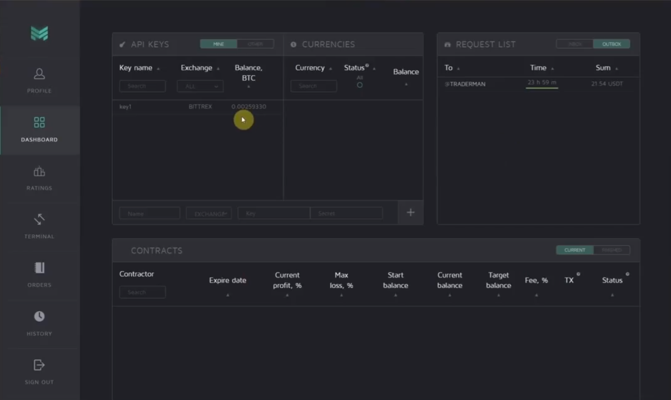
One of the main tragedies has been the tabs overload and the incomprehensibility of the displayed information. So I started the redesign with the most inconvenient, but essential page — Dashboard.
Solution
Even though I thought about options that wouldn't change existing pages so much, it didn't work out.
After all, I came to the decision to combine and reduce some amount of tabs in favor of creating a single board of all contracts on which you could find all open and available offers from both investors and traders — this was not previously possible, but the study showed that being able to search for investor too is an important feature for bulk of users.
So this is how the Contract Board was made:

Problem
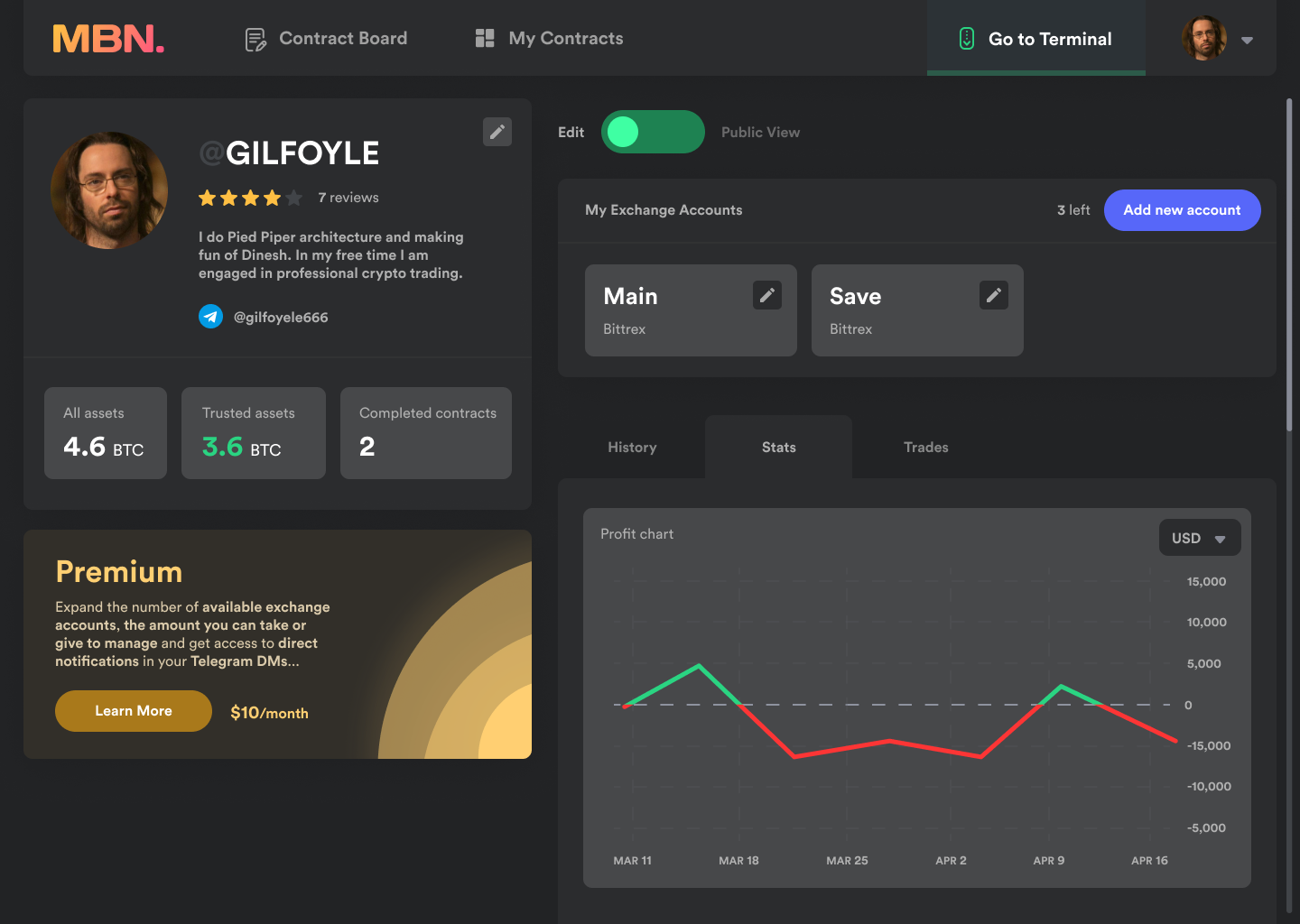
Another difficulty was honed in the epicenter and "heart" of the platform — Trader's profiles and the process of concluding contract itself. Just like the Dashboard, it wasn't intuitive enough and take too long to get to the final point.

Solution
The solution was to create a slightly different arrangement of main components that now would focus on important information, as well as show all available offers that were put up on the global board.

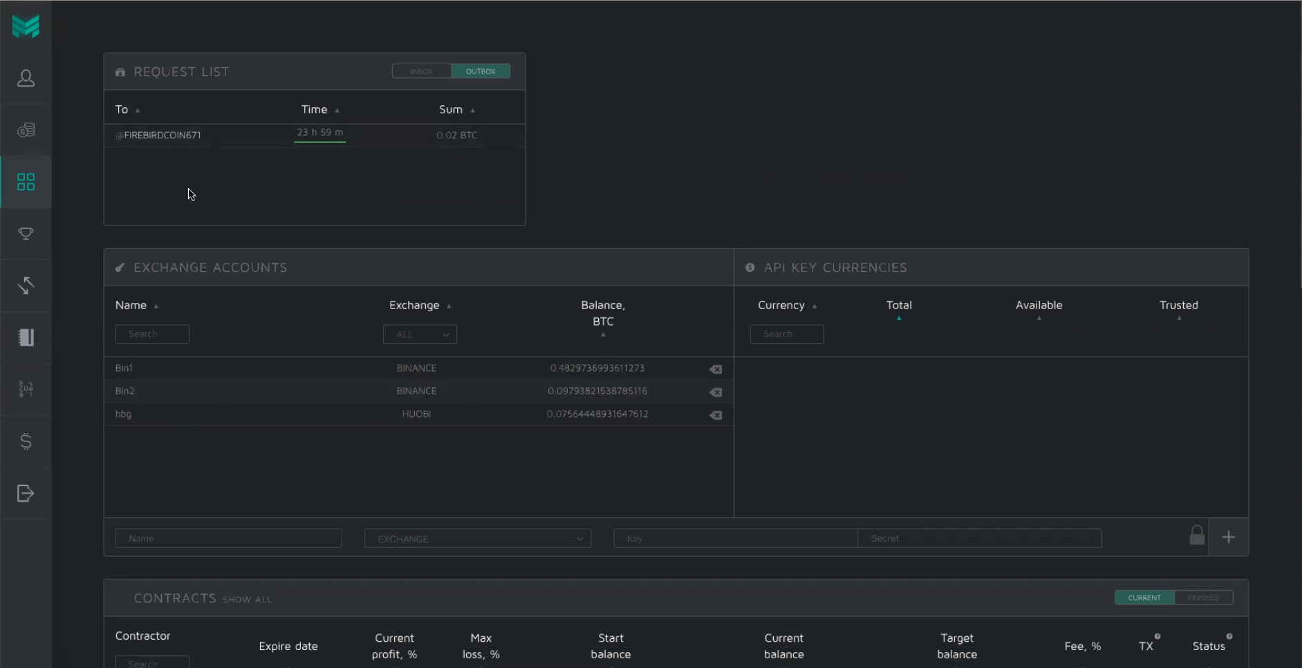
As for personal profile, I've added the ability to manage all the exchange accounts in one single and comfortable place.
Problem
The entire contract flow was distributed across multiple pages (Dashboard → Trader's Profile). So many of those who tried to sign contracts barely found the information they needed (for example, about the trader's fee or how to pay it) and immediately got lost.
i.e. after signing a contract on the trader's profile page, you have to head to Dashboard to pay a fee and see the current status (e.g. pending).
Solution
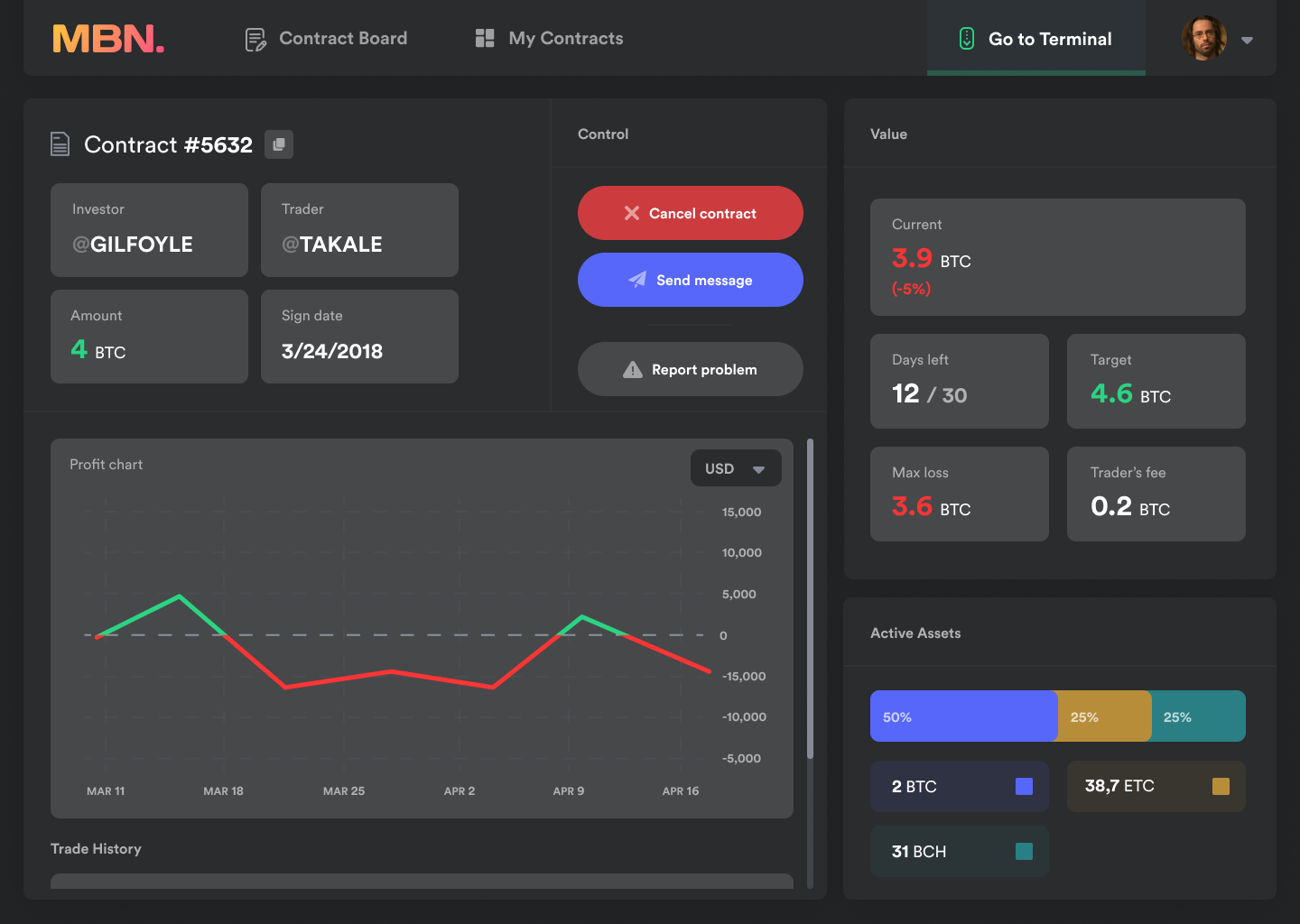
Along with a completely new Contract Board, I've created a separate tab where users can see all active and completed contracts, as well as all the necessary information.
It's also felt right to add direct messages between traders and investors, as many wanted to have this ability to solve small inner problems (e.g. asking for a little bit different conditions, etc).
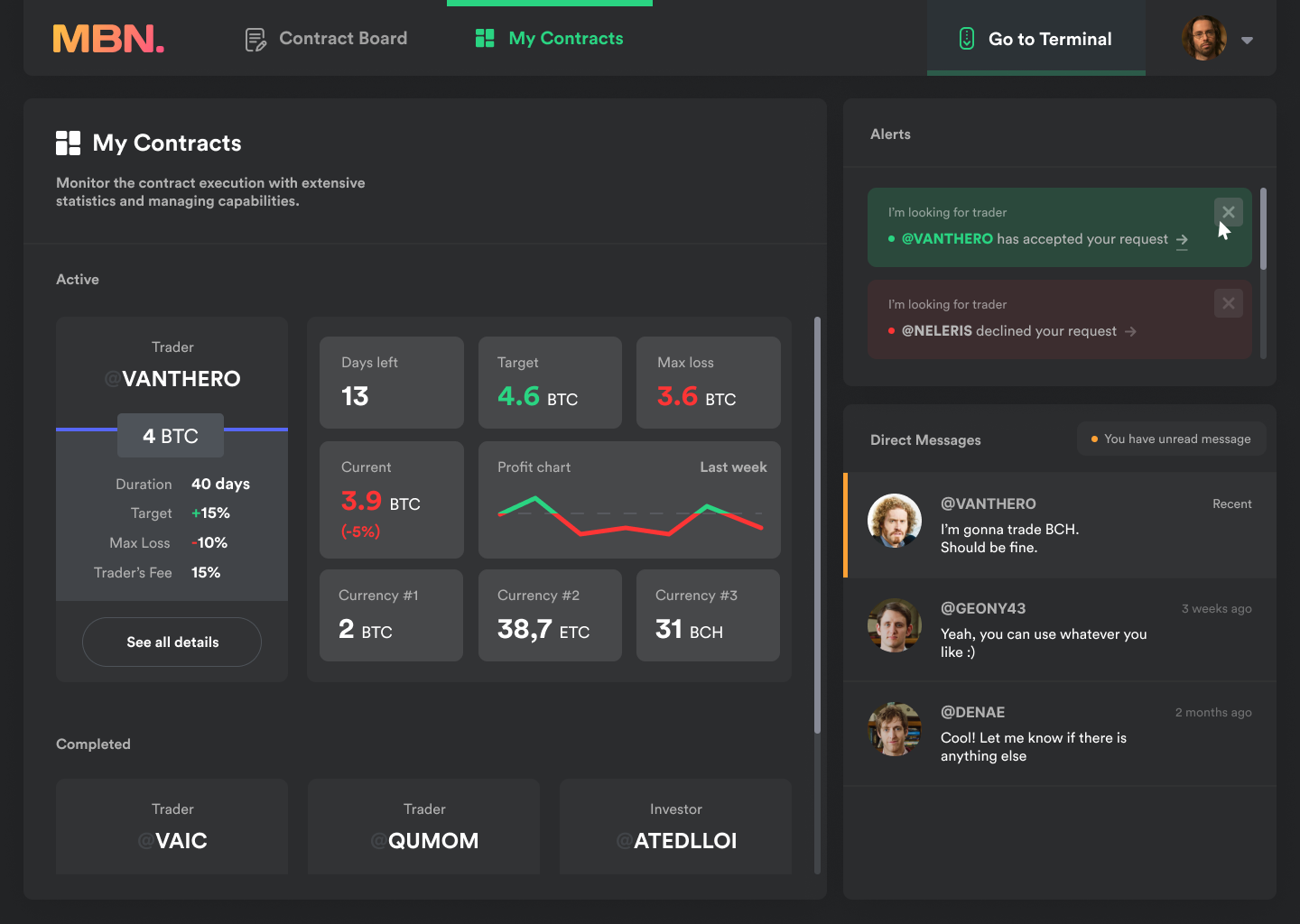
Each contract now also has its own separate page where users can see detailed statistics and all the necessary controls.
Problem
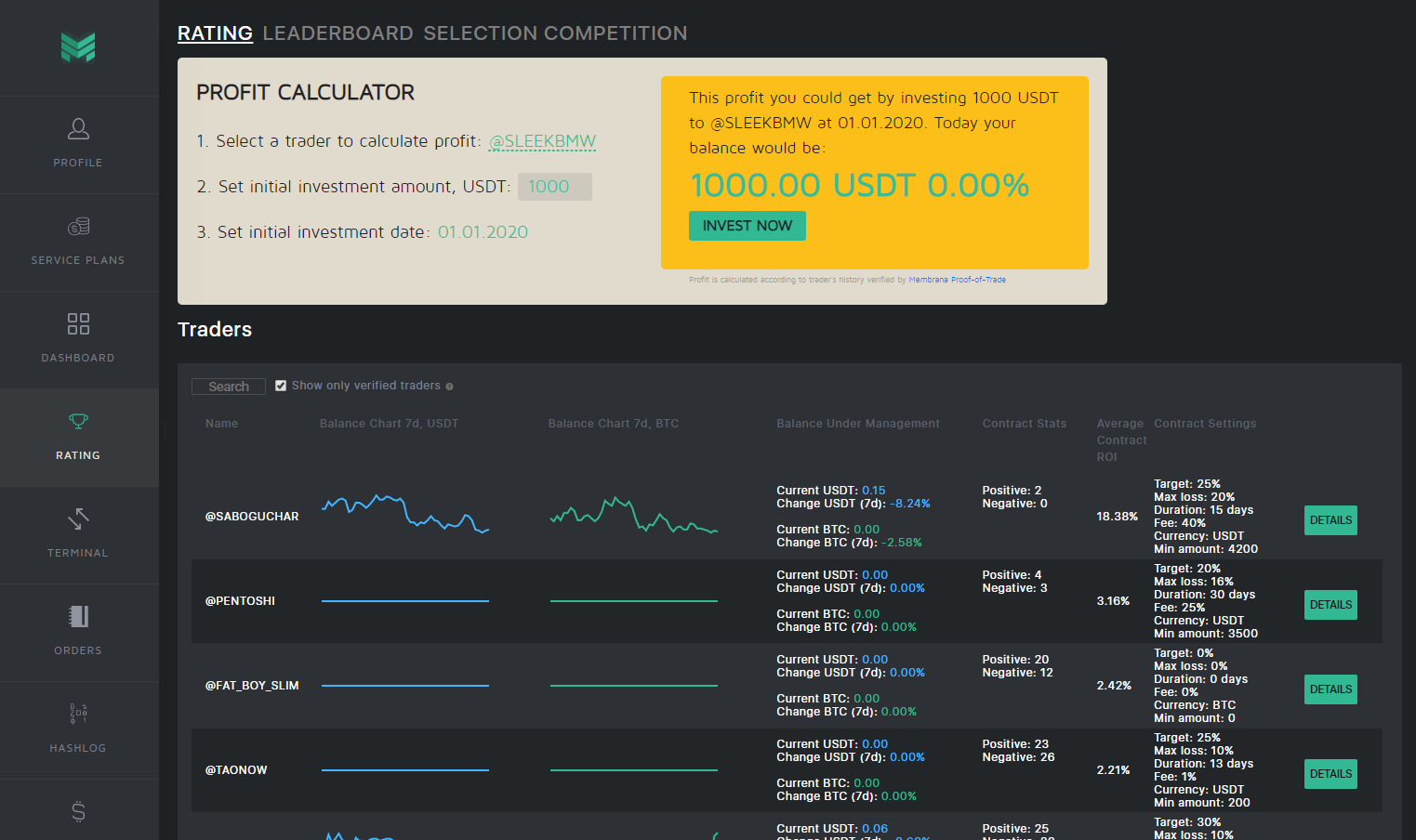
The last problem I worked on was the Trader Search page. In addition to being unintuitive, it was also endowed with unnecessary and impractical data (Let's say, Profit Calculator*)
* "profit calculator" allowed you to find out how much you could have earned if you had invested in this trader some time ago
Solution
As you may remember :) I combined several previously existing pages into one and now the search for traders, as well as investors, is located on a single page called Contract Board
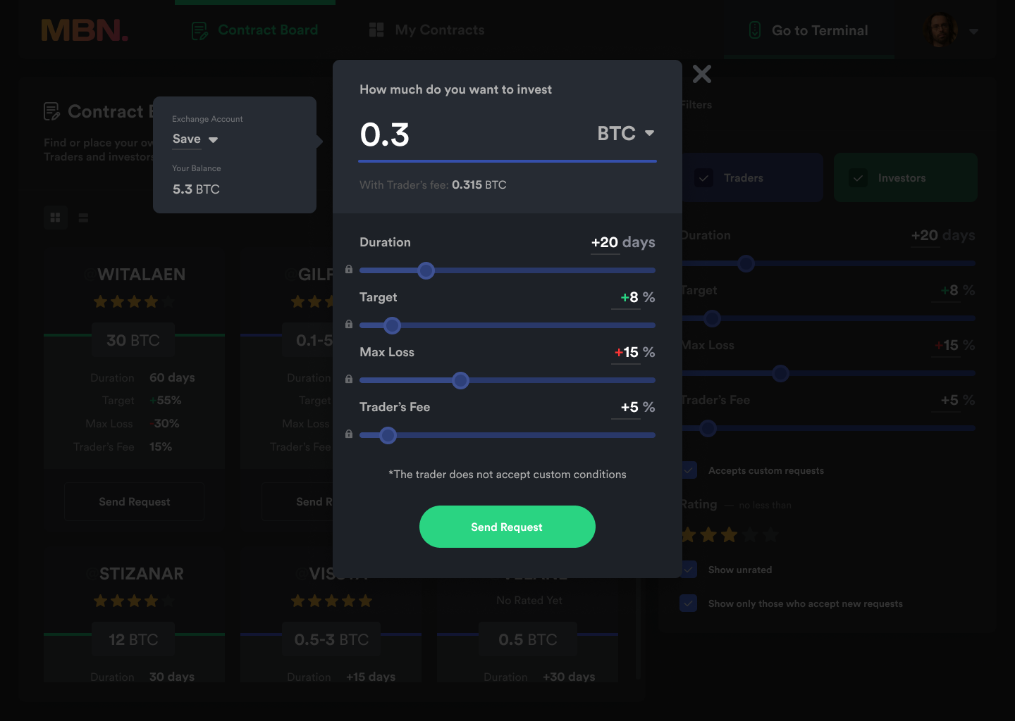
I also tried to improve the contract signing process which now let you to see the balance of any of your exchange accounts, and also allows you to conveniently edit various terms.
Thanks for scrolling down here!
